Tuesday 16 November 2010

The last couple of weeks - James Howard-White

The last couple of weeks of our assignment we all seemed to really pull together as a team. When I last blogged I had finished a few musical ditties for the congratulations segment of our quiz. It was Wednesday the 3rd of November and Callum, Tony and myself were working to a self-imposed deadline of Friday the 5th to have the congratulations segments completed so that James Medd would have the weekend to incorporate them into the patch before visiting the museum on the Monday.

Late Wednesday night I received a text saying that the requirements had changed, the musical ditties I had made previously needed to be six seconds long along with a projector sound, a projector burn sound and a congratulations voice-over. Not only that but that he needed it as soon as possible on Thursday, to which I replied that I would have it ready for him by 2pm that day. Thankfully some of the original tunes could be edited to the new specifications but some had to be remade. A projector was put together by recording a fan heater which was effected and filtered to create a low rumble and a regular fan with cardboard stuck in which was also effected and filtered to create the high click effect.

Once it had been completed I had the audio ready on time and arrived at university to find Tony had postponed his voice syncing my dialogue to the Vendor animations (also needed by Friday) in order to help Callum as they had decided to really go all out on the Congratulations videos. Callum was busy putting together the videos and Tony was painstaking animating a highly detailed drawing of a large wicker basket that Callum had previously drawn onto the computer. Having added the audio to some of the videos Callum and Tony had decided that the Amber charm video needed a little extra and included an owl. So I spent a few minutes creating a improvised owl sound using a mac laptop mic and Audacity. After I had left a received a text later saying the urgently needed a snake sound, which (after a few experiments) I managed to email back to them after about 10 minutes. Thankfully we had it all finished by the self-imposed deadline.

-------------------------------------------------------------------

After our first museum meeting we all met up during the week to iron out the creases with the patch. Our main issue was that we didn't have the processing power to incorporate everything we had created. James Medd had experimented in news ways to streamline the patch so we had some scope and spent the afternoon discussing what should be included and omitted and some last minute tweeks. This involved regular rounds of tea, ideas being batted around and James working frantically on his laptop. After about 5 or so hours we finally had (barring a later discovered typo or 2) a completed patch.

To conclude, I'm delighted at the way in which we worked together the create our exhibit. We all seemed to work to each other's strengths, met up together regularly and imposed and kept to our own deadlines. I find the sheer volume of the video work done by Callum and Tony quite staggering as well as the fact that they managed to maintain a high quality. I'm sure I'd also feel the same about James Medd's interface work if I can ever figure out how he managed to do it.     

Project Overview and Evaluation - Callum Ward


The extremely collaborative atmosphere in which this project has been undertaken has been present ever since James Medd, James Howard-White, Tony Ball and myself first convened to discuss our ideas and objectives for the coming weeks. 
After viewing the interactive exhibits already on display at the Rotunda Museum we had a basis for development and we outlined what we believed to be the most important concepts to bear in mind whilst designing the exhibit; these were that it be clear, concise and engaging to users across our target age group of fourteen to twenty-four year olds.
With these things in mind we explored many possible routes for development before deciding upon the apothecary scenario. We felt this idea was a suitable platform for displaying the information about the charms in a readily accessible fashion whilst also offering ourselves a large area for experimentation with interactive elements and the audio/visual experience.
We sketched out our respective ideas for the visual layout of the program and discussed what environmental sounds would be required and as soon as we had come to an agreement we started work.
All the animation that appears in the final exhibit has been created using the same production technique; I designed and illustrated the graphics freehand before they were scanned in and coloured digitally by Tony. We have worked together closely and Tony has several times asked me change aspects of a design or create supplementary elements to incorporate into it, similarly I have often discussed changing colour options, styles and other factors with him. 
Both James M. and James H-W. have also been on hand throughout the graphic design process to offer their thoughts and opinions on its direction. 
Tony and I were in constant dialogue with James H-W. who was responsible for audio production as we needed to keep him informed of any design elements that would necessitate the use of foley sounds such as the opening of a chest, rain on the windows or bubbling liquids on display in the apothecary. 
James Medd, who has been responsible for the design of the MaxMSP interface, was also frequently in touch with Tony and I ensuring images were the correct resolution and letting us know which items needed to be created as separate sprite objects as opposed to static elements fixed in the backdrop so he could incorporate them into his programming.
In addition to feedback from within the group itself, we also reacted to feedback from Rob Mackay and Mark Hildred as well as from staff at the Rotunda Museum with whom we met several times throughout the production process to discuss conceptual progress, factual content, graphic design and interactivity within the program.
I wrote the information segments about the charms which appear in the exhibit. After initially writing these information sections and meeting with museum staff they expressed concern that they may be too difficult to understand for people who wish to view the exhibit but who fall below the fourteen to twenty-four year old target age group. I subsequently rewrote the information sections omitting any vocabulary which may have been confusing and separating the content into smaller statements which can be scrolled through by the user at will.
James H-W. and I researched the charms and thought out potential questions for the quiz before I worded them and provided them to James Medd for inclusion in the program. We had two options for how the quiz should operate; trial and error or sudden death.
The trial and error option gives the user as many attempts as they need to answer each question therefore the user always ends up winning. Sudden death would allow the user only one attempt at each question and subsequently if the user answers incorrectly they would not be shown the congratulatory video. We decided on the trial and error option for a number of reasons but two reasons in particular stood out; firstly the museum staff had already made clear the need for the exhibit to be appeal to users below our primary target age range and as a group we felt that the trial and error option was more child friendly, always offering a reward for persevering with the quiz. Secondly, our exhibit is competing for the attention of museum visitors against larger exhibits that the museum places more focus on. Failing one section of the quiz could be all the incentive someone needs to abandon our display, referring back to one of the key objectives we outlined at the start of the project, keeping the user ‘engaged’ is paramount therefore we didn’t want to risk giving the user this incentive to leave.
The quiz questions are separated into categories about each individual charm and as well as writing the questions themselves I was responsible for the creation of the congratulatory videos which play upon the user’s successful navigation of each category. I used Adobe After Effects to create the videos and Adobe Photoshop to create some of the elements used within them (for example the scratches that flicker frame by frame). I asked James H-W. to create several separate sound files such as the projector starting, the projector running, the film burning, appropriate music for each scenario, the character saying congratulations and a few foley sounds specific to each environment and requested that some of these sounds were of a specific duration. I then arranged these sounds alongside the video content. The illustrations used in the videos were created using the same animation technique as the rest of the program with Tony digitally colouring the illustrations  I designed for the videos and providing me with them as soon as they were complete so I could incorporate them.

James Medd asked Tony and I to then create MaxMSP patches which would play our sections of video (Tony having created videos of the apothecary character that were lip-synched to match James H-W.’s audio files) upon receiving a bang from his main patch. As we had planned for Tony’s video of the apothecary character to play continuously on the main screen and for my videos to only appear when the user was playing the quiz, after completing my MaxMSP patch I passed this on to Tony so he could incorporate it into his own. After trying this new section of patching with James Medd’s main interface we found it didn’t run as efficiently as we might have hoped.
We got together as a group to discuss our options for improving the efficiency of the patch and how best to work with the hardware that the museum was providing. We found that it wouldn’t be possible to utilise all the ideas which we had generated and so decided upon the substitution of the lip-synched video Tony had created for a still image and the alteration of the MaxMSP patches Tony and I had produced, previously based around the ‘movie’ object, to now be based around ‘jitter’ objects making more efficient use of the computer’s CPU. The decision to omit the lip-synched video as opposed to the congratulatory videos was taken as we felt that the lip-synched video wasn’t integral to the overall experience of the exhibit. The congratulatory videos offer a reward to the user upon completion of each section of the quiz and an incentive to complete the other categories. The lip-synched video, whilst impressive and certainly more desirable than a still image, has far less a significant impact on the user’s experience. With this decided upon, Tony made the necessary alterations to the video patch and after James Medd had incorporated all the proposed changes to the program its functionality was greatly improved. 
On Monday the 15th of November we presented the fully operational exhibit to staff at the Rotunda Museum.
If we’d had more time to work on the project I would have liked to expand the content of the exhibit to feature a greater range of charms. I would also have liked to experiment with a broader range of challenges and games for the user to experiment with as well as a greater range of multimedia content. I would also have liked to create quiz sections of varying difficulty designed to appeal to different age groups allowing us the freedom of using the ‘sudden death’ quiz format as well as ‘trial and error’ allowing us to cater more specifically to different users. Whilst the time scale of this project played a part in our not being able to implement some of these ideas, the hardware we had to work with also impinged on what we were able to achieve. If we were to design another exhibit, I would prefer to use more powerful hardware capable of supporting a great deal more multimedia content. If given more time and the benefit of such hardware I would link many more objects in the apothecary environment to audio and video content that we couldn’t have justified including with the current set up.
That said, I feel we worked well as a team to draw as much as possible from the available resources, we kept ourselves well informed of each other’s progress and activity and we have consequently been able to offer each other advice on all aspects of production from start to finish. I feel extremely pleased with what we have achieved in the time frame and now the project is completed I would like to thank James Medd, James Howard-White and Tony Ball for all their hard work on the project and thank the Rotunda Museum for the opportunity to have our work displayed. 
Animating Chemist Brown - Tony Ball

After processing our Vendor through Adobe Photoshop and Illustrator I exported a series of 30 Images, each displaying a unique expression from our Vendor. By this stage of the project, work had really mounted as we aimed to have our patch completed by Monday 1st November. After a short discussion, Callum and I decided we would push to achieve the congratulatory videos we desired rather than settling for the next best thing. This took 24 hours of solid work leaving me with but a couple days to get the Vendor Lip synced and exported ready for the large display.

Due to the organisation and preparation of the audio created by James Howard-White I was able to get started as soon as my task to aid Callum with the congratulatory videos was complete. I imported the audio file created by James into Final Cut Express and then dropped it into the time-line. By slowly scrolling over the audio file I was able to place appropriate expressions that best suit the syllable sound. Preparation on my own part ensured that I had very little trouble when applying the images to the time-line.

 Here are the final drafts of the lip synced Vendor ready to be placed within the patch.


Chemist Brown's Introduction


Chemist Brown's Introduction To The Quiz

Large Display - Tony Ball


Saturday 13 November 2010

Videos - Callum Ward

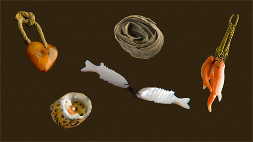
Here are the five videos I created for the exhibit.
The Skin of an Eel

The Amber Heart

The Bleeding Tooth Shell

The Mother of Pearl Fish


The Red Coral

Finishing The Installation - James Medd

Planning For Completion

As a group, we spent most of Thursday sitting down with all the final elements of our installation to take a look at our options and complete the piece. Having encountered a few small issues surrounding the integration of large amounts of animation and activity on the larger screen - slowdowns and lockups due to a high amount of required processing - our video and graphics duo had spent a couple of days refining and optimising the way in which the big screen elements worked, as well as coming up with potential contingency plans.

Final Experiments And Decisions

Upon experimenting with using our interactive screen patch with the optimised video patch, we were very close to having them both work together as we wanted. Unfortunately however, we were just not quite close enough. We believed that, for the sake of what we outlined in our early plans and presentations i.e. an interactive installation that operates in a slick and functional manner, dialling back the additional features for a balance between something very 'pretty' and ornate and something smooth and functional was a necessary compromise.

Our Reflection

The fact is that we are all, as a group, very happy with our final piece. We feel we have met all of our aims outlined at the beginning of the project and created something that the museum staff are happy to display. Any of the features we are missing out, whilst being extremely nice, do not in any way hinder the overall piece and in a way show that our piece has had clarity and functionality right from its core, rather than from any additional elements we could have thrown on top.

As a brief side note, I'd like to write something about our blog posts in general. I have seen in comments recently that the overseers of this project would have perhaps liked to see a few more, shorter posts about each step of development. As part of a general reflection on the process, I'd say that I'd have liked this to be the case also, however in the short time frame that we have had, I think most of the group honestly have been far more wrapped up in working on the piece and co-ordinating with other group members to stop after every small stage of development and post an update. This is especially true of the multiple times during the project that things were changed not long after being implemented, which may have lead to confusion about the actual content of the project. I believe that on a longer term project, regular blog posts may have been easier for us to contribute, I only hope that the final product itself is enough to prove how consistently and regularly hard we have all worked as a group on this project.

Thursday 11 November 2010

Graphics - Tony Ball

Throughout the project so far I've rarely had the opportunity to close down Adobe Photoshop and Illustrator. As you can see from interface videos posted by James Medd and Congratulatory Videos compiled by Callum, work is always progressing. As there are a few aspects to our Interface I'd like to address I'll separate this post into smaller subsections, beginning with:

The Main Interface Screen

Previous posts ("Some Of Our Progress So Far/Second Pitch") explain in a broader sense to how all the pages are created. Here I shall explain how I refined my technique to fit our brief. Initially Callum would hand me a fully drafted drawing of the page/room. From scanning these images into my computer I trace over them as accurately as possible in Adobe Illustrator to give myself a plain outline of the room. These outlines provide my images with the cartoon-like appearance which helps me reinforce my aim to create clear and simple-to-understand illustration I discussed in my brief.

After tracing the images I import my new black outlines into Photoshop ready for painting. I colour the image by applying block colours to highlighted sections and applying gradient by using the burn and dodge tool. When looking at screens close up to add texture I'll experiment with some filter effects.

Photobucket
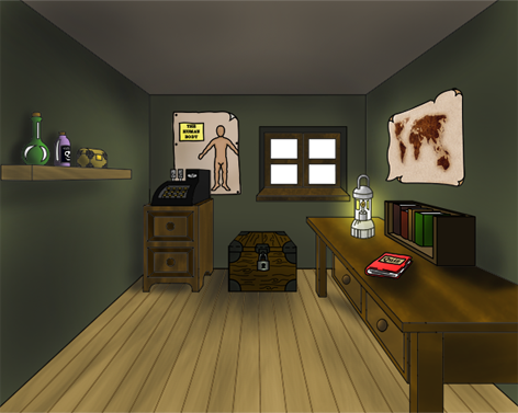
The main interface screen, fully rendered.

Photobucket
Me applying effects to create a wood-like appearance

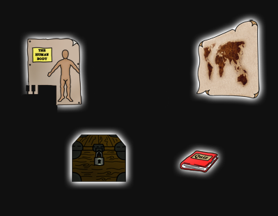
To create the glowing buttons I singled out the objects James planned to use on the main screen making everything else invisible and applied an outer glow within the blending options. I exported this on the full 1280x1024 resolution meaning James can just lay the image above the original image of the room and adjust the alpha channel creating the glow.

Photobucket

You may notice on the main interface image that I've left the window panes transparent. This will most likely appear black or white when embedded on the blog as it may not support transparencies of PNG files. By keeping the panes transparent this allowed me to create a 360x240 pixel video of rain that I created in Adobe Photoshop and Final Cut Express. How I created this was a mixture of "Fibers" and "Motion Blur" filters upon a black layer within Photoshop. By adjusting the position of the 'Rain' layer I could create the illusion of movement. I exported a series of 6 images that I could import into Final Cut Express and animate into a second long loopable video.

I used the same effect at a larger scale when creating the rain for the shop front introduction screen.


360x240 Rain Loop

Wednesday 10 November 2010

Screen Shot Of Video Patch For Large Display - Tony Ball

http://i49.photobucket.com/albums/f289/tony_ball/Picture1-1.png

At the above link is a screen shot of the new patchwork for the large display following Monday's (08/11/2010) presentation. I know the resolution set on the jit objects are incorrect but for the purpose of me being able to test it's functionality on my own screen I've set it as 1280x720.

This patchwork is much more simplified in comparison to the one presented on Monday and is flawless when tested on my own television. I Haven't yet integrated it into the main interface patchwork of James' so if it still causes major issues or not is still undiscovered.

The only issue I have with this patch is the use of delay objects to stop the video from looping. I've noticed from past experience that the delay object can be quite temperamental and sometimes doesn't work. There's also an issue of when I start one video halfway through another and the bang from the first video stops the second halfway through.

I'm working on a solution for the latter problem which I'm sure I'll find one but if there is a way of stopping jitter looping without the use of a delay object that would be great.

Monday 8 November 2010

Finalising the Video & Graphics - Callum Ward

Tony and I have now finished creating the graphics and video for the installation.

Using the same technique previously demonstrated I designed the required animations freehand and gave them to Tony to be digitally coloured. I then started work on creating the congratulatory videos using Adobe's After Effects software.

As a group we decided on making the videos appear as if they were being shown via a projector; the first action I took was to create this effect.

I asked Tony to create a black frame in photoshop and placed this on the top layer of every video. I then used a number of filters such as tint and grain and applied them to an adjustment layer which I used on all animation layers beneath the frame.
To generate the flickering effect that projectors have, the opacity of a plain grey layer oscillates on a timer. This effect had to be lessened on the darker videos as the effect was amplified by the contrast between the dark and light layers and it became overbearing.

To complete the feel and texture of projected film I used Adobe Photoshop to create stylised black scratches on a transparent background and had them appear at just one frame at a time in random patterns and combinations.

Once the projector effect had been created I imported the images for each video and sequenced the automation. I then imported the audio files that James H-W provided me with and arranged them within the video, I asked him to create several separate sounds, a projector turning on, the projector running, the projector turning off and film burning, music for each scenario, and a few foley sounds such as an owl hooting and a snake hissing. Once I had arranged the audio to match the images I rendered the videos to the appropriate resolution.

The initial quality of the videos was extremely high so I asked to Tony to import them into Final Cut and render them to the same quality as all the videos that he had already created using that software.

I will be posting the videos on this blog once they have been uploaded onto YouTube.

Once the videos were completed, James Medd asked me to create a simple MaxMSP patch that would play the videos on the large display screen upon receiving a bang from the main patch. I used the ‘movie’ object as the basis of this patch.

After testing the whole MaxMSP program with all the video Tony and I have created we have discovered that we need to make some decisions on which media we are to include in the final patch. As a group we will be investigating all our potential options over the next few days.

Wednesday 3 November 2010

Audio Updates (James H-W)

Been a lot of work over the last couple of weeks or so that I need to catch everyone up on. Firstly having armed myself with a wealth of foley sounds, work has been completed on the environmental audio. The environment is mainly comprise of sounds recording of the hustle and bustle of Scarborough town centre which has been edited so that easily audible passing conversations don't appear. These are then mixed in with recordings of wind and rain which are mixed and EQ'd differently depending on whether the user is outside of the shop (at the beginning) or inside. Inside the store the bubbling elixir experiment is separate to the rest of the background audio and is a mono recording which helps with placement and also helps by looping at a different time to the rest of the audio. Other spot sounds such as thunder and horses have also been created to be triggered separately. Other environments have also been recorded for the origins of each charm. These sounds are mostly made up by foley sounds and some studio magic, but the mother of pearl fishes eastern market environment has had some BBC sounds blended in one comprising of foreign spoken busy streets and a highly edited environment which included an eastern instrument playing in the background where busy road traffic had to be edited out. This was done mainly due to a shortage a busy foreign streets and eastern instruments in the Scarborough area.

Perhaps the largest body of audio work undertaken for the assignment has been the voice over work. The main idea was to go completely over the top with the amount of dialogue recorded often creating multiple takes of the same sentences as seemed better to have too much and scale back than to have too little and keep having to return to the studio. The voice (if I say so myself) seems to work very well but I'm not a trained vocal actor and the recording process was quite painstaking as the longer sentences often needed multiple attempts and a lots of time spent editing out mistakes. After long periods of editing regular sanity checks had to be made as the constant sound of my recorded voice playing over and over in my head was rather maddening and wouldn't stop being mentally replayed during tea breaks. The dialogue itself was a mix of pre-written ideas and some some improvisation, the quality of the audio has been produced to give his recorded voice an aged quality.

Most of last night was spent creating winning musical phrases which are to be played when the user wins a charm which Callum Ward would then use to create congratulations videos. The requirements being that they each had to be about 5 seconds long, reflect the environment in which the charms are found as well as reflecting the fact that the user had won a prize and we all decided that it would be good if the phrases were 'rubbish in a good way'. Having completed the work late last night I hope that I've found a good balance and that there's not too much 'rubbish' and not enough 'good way'.

Time was also spent creating some icing on the cake sound effects mainly feedback ideas we had been given during Mondays lecture which they'd like to see incorporated into our design. These were deemed to be luxury items to be added if we had time once the essentials had been completed. This consisted of little things like a chest opening sound and a dragon growl to go off when someone pressed on the dragon on our map. I actually brought in an out of work session dragon to be recorded, you can imagine the health and safety issues that were involved, hours of paperwork.

Saturday 30 October 2010

Patch Building Update - James Medd

I've been pretty busy this past week getting our interactive installation prepared for a prototype presentation this coming Monday. I thought it right to give a quick update on what I've been doing:


- Now that we have all our quiz questions prepared, I programmed in this section earlier this week. It was a little tedious after a while but paid off! There are a minimum of three questions for each of our five charms giving a good amount of content for the user to interact with. To keep a friendly feel to our age range, we have opted for a trial and error method. While this is not so much of a challenge, it does take out any potential frustration for the user.


Since creating the first version of the quiz, our graphics members have created the accompanying visuals which I have now integrated, thus making the quiz practically complete bar a few potential aesthetic tweaks!


- Now that every screen/section's main visuals are complete, we no longer have any blank screens to end up at (huzzah!) and most sections now have the core of their interactive elements in place bar a few additional graphics and informational content. These may not be entirely complete for the prototype viewing but it should be clear how each section works. With a bit of careful programming I have also been able to include some of the graphics members' subtle embellishments in certain areas too, this will be seen on Monday!


- Now that the majority of our audio elements have been recorded, the installation is no longer silent! Various elements of background and triggered sounds are now in place with all appropriate timing considerations and fades programmed in. There are still plenty to go but there should be enough included in the prototype for everyone to hear how they will work in the context of the installation.

There are probably a handful of things I have forgotten but anything that I have missed will be seen on Monday afternoon. Things are most definitely taking shape! Video/Images to follow prototype presentation.

Tuesday 26 October 2010

Our Interface With The Touchscreen - James Medd


Hello all, just a quick post following my first practise using the interface on the touchscreen this morning.

My principal jobs so far with this project have been to work closely with the graphics/video members of the group in the design and creation of our interactive interface and to assemble the interface and content within MaxMSP – putting it all together!

I’ve been working over the past fortnight or so to build the interface at home on my laptop and today I took what I had so far to use with touchscreen. As planned, everything is nicely spaced and laid out, clear and most importantly, feels very easy to operate with the screen and runs very smoothly.

The video below shows me briefly operating the device, showing off the overall look and feel of the interface, with some of the animations and graphics now in place. Obviously there is still a lot of content yet to be integrated on the other pages but you get the idea of how it’s going to work.

Just a quick note to Rob, I have emailed you about this but we will need Max to be upgraded to the latest version (5.1.5) as some of the added functionality with certain objects is necessary to how our installation works. The DMG is on the desktop of the Mac Mini but needs the administrator password to be installed. Thanks!

Monday 18 October 2010

Some Of Our Progress So Far/Second Pitch

In this video we expand on the previous pitch (see earlier posts for transcript and video of presentation) and also show some of what we have so far. These are the very early stages but should help to give an idea on how our interactive installation will function.


Friday 15 October 2010

Audio - James Howard-White

Spent much of yesterday hunting for possible foley sounds in town. The main aim was to acquire some busy background street recordings, however much of wanted street ambience was filled by an awful trumpet busker playing along to one of those chill out mood backing CDs that my Mum buys. Therefore I found myself having to work around this guy who's trumpet carried pretty much the entire length of the high street.

Nevertheless I acquired the sounds I needed and have been experimenting for the last couple of days (stay tuned for a couple of examples). Work has also begun on our vendors voice, considering my limited vocal talent we decided I come up with the voice before Callum and Tony work on his appearance.

Thursday 14 October 2010

First Steps With The Interface - James Medd

Just a quick note to say I've been doing some work on a skeleton interface. It's very plain and is obviously full of placeholder buttons, backgrounds and text right now but it's been giving me an idea of how our idea might be realised in MaxMSP.

I'll be convening with Tony and Callum shortly to get some of their early graphics and drop them into what I have so far. Then I'll post a quick video of me using this 'barebones' setup!

@Rob MacKay: Any chance you might be able to give us the resolution for the touchscreen? Cheers!

Pitch Transcript - All Members

Here is a near enough a full transcript of the pitch we gave on Monday. I believe Rob is making the video available this week, he was working on it in his office today!

Introduction - Callum Ward

Hello,

We have been assigned the ‘health’ orientated selection of charms and the proposal we have in response to the brief and the criteria which it outlined is to create an interactive ‘apothecary’ store run by an eccentric salesman character who will guide the user through the content.

The ‘apothecary’ scenario allows us deliver information about the charms in a way which will hopefully appeal to the primary target age group of 14 to 24 year olds whilst also having something to offer for people above and below these ages.

After visiting the museum and viewing the interactive displays we discussed what we did and didn’t like and sought to incorporate our evaluations into the display concept throughout it’s development.

Three key words that we focussed on throughout all aspects of planning were ‘engaging’, ‘clear’ and ‘concise’. The nature of the subject matter and the positioning of the display within the museum demand that visitor’s attention is easily caught and any information imparted to them is done so in a simple and succinct but also memorable fashion.

The use of videos, written text, audio files and quiz sections within our proposed concept should ensure that every user will be able to find something in the display that will to appeal to them.

We each have defined roles within the group but we will be working closely on the project and intend to overlap our work to an extent to ensure consistency throughout all areas of production and clarity in the final outcome.

I’ll now pass you on to James Medd who will walk you through the interface aspect of our proposal in more detail.

Interface Design - James Medd
As Callum mentioned, the core of our interface is based around an interactive apothecary environment that the user will explore in order to gain information on the charms before taking part in activities driven by the shop owner character. We are aiming to provide enough interactivity to give the user a sense of the control and hopefully enjoyment, but an overwhelming amount of interaction that may lead to a frustrating or confusing experience.

As we have said and will continue to say, clarity and functionality are paramount in the project. We are hoping that relatively small amounts of concise text and obvious points of interaction will help achieve this. Despite the seeming simplicity of this design however, the interface will be embellished with audio, video and polished graphics in order to maintain an engaging experience, with a good amount of visual variation to avoid a static aesthetic.

A few additional notes now: control is something we consider to be an important part of the interactive experience, therefore among other measures, we plan to allow the user to 'cancel'/'skip' or 'go back' at anytime so as to keep their interest. As Mark stated last week when he was here, there's nothing more frustrating that being trapped somewhere you do not want to be!

Linked with this, given the potentially difficult age range we are dealing with, we realise not every user will be after the same sort of experience. With this in mind, there will be options available for those not inclined to take part in activities such as quizzes but who still wish to have fun interacting or gaining information about the subject.

Finally, we are also planning rigorous testing to avoid bugs and crashes! I'll let James Howard-White tell you about the audio side of our project.

Audio/Sound Effects - James Howard-White

Back in the Victorian era the sale of medicine relied heavily on salesmanship, perhaps more so than the actual effectiveness of the medicine itself. Vendors depended on terms such as 'secret ingredient' and 'ancient mysticism' to promote their cure all elixirs, amulets and charms. Using a fully voiced character, we intend to incorporate this bravado into our design. Our character will help by immediately engaging with the user, humanise our exhibit and add a touch of comical value. He won't be heavily scripted and the real trick will be ensuring we optimise the character with out over doing things, slowing down the users experience and ensuring that on screen information don't overlap and become confusing.

Diegetic will be a bit of a buzzword when it comes to sound. Everything will be taken from the environment. The voice-over, the bubbling of the latest elixir experiment and the hint of a busy shopping street outside.When looking up information on the charms we want to subtly mix in sounds of the environment in which they can be found. A sea shore, under the sea or in the case of the mother of pearl fishes, an eastern market. Other than the character, we want the sound to primarily enhance the realism without being a distraction.

Tony Ball will now expand on the visuals we'll be using in this project.

Video/Graphics - Tony Ball

Hi, I’m Tony and I’ll be collaborating with Callum with the design and production of all the graphical aspects of our installation.
We aim to emphasise the era and the purpose of the health charms with a Victorian styled apothecary. To illustrate this we’ll be opting for a hand drawn and computer rendered appearance that will balance the need of simplicity whilst avoiding looking too much like a child’s cartoon.
As previously mentioned, we plan to include the salesman type character to play host to our patch. I’ll be working closely with James and Callum in creating this character making sure he is an accurate representation of the era as well as refining on his quirky characteristics and lifelike habits.
We will also be designing a variety of other objects with the potential of interaction: either acting as buttons or just small pieces of animation to bring some life into our patch. Again this is to enhance the user experience when using the interface.
To maintain Clarity we will be keeping our designs fairly minimal. This will hopefully ensure that interest isn’t lost in the confusion of what to press on screen. 

I believe at this point Callum then asked if there were any questions! You'll see those in the video!

Animation - Callum Ward

I started work on animating the interior of the apothecary scenario on 11/10/10 and the base layer of this animation is now pretty much complete as you can see in Tony’s post below. After I drew the images freehand they were scanned in to be retraced and coloured digitally by Tony. Next to come will be the front of store and smaller sprite objects that are to be placed within these environments such as the charms themselves and the shopkeeper character.

First Draft of Apothecary - Tony Ball

Hey Guys, Got a draft done of the apothecary. Comes in red or green (and darker ceiling if desired) I've tried my best but no doubt I could make it look glossier given time. I'm not sure why we have a metallic till. I was thinking of turning it into stacked boxes. Anyone have any problems with this?

Let me know and I'll get cracking on it in a few days. For now, I'm gonna dedicate some time into learning Jitter.


Monday 11 October 2010

Critique of the Rotunda Interactive Exhibits (James H-W)

Huddled in the Rotunda museum we were all informed that we needed to write a critique on the two interactive exhibits they had available. Unlike the group of small exhibits and the larger dinosaur screen was quite distracting during our conversation and was very inviting. It was inevitably the first display I investigated once we were free to explore.

As it had appeared from a distance the Dinosaurs of Yorkshire exhibit was very engaging. There only a limited selection of options available at any one time which made navigation simple and easy. The interactive game where you could place the plants, current animals and Dinosaurs into your own setting was enjoyable. The game could be played properly but if the user wanted to fool around and create a bustling dinosaur metropolis where nothing would be able to move (like we did) the program handled it smoothly. Commentary from the expert was short and to the point, not an unnecessary over abundance of information. Although a few of the revelations the exhibit tried to teach were perhaps already well known by most “Crocodiles are at least as old as the Dinosaurs” left me wondering if that was really the best they could come up with. The game process worked very well, before being allowed to place your Dinosaur into the backdrop you first had to pick from a selection of eight, two of which were red herrings. There was a brief bit of information from the expert that was slipped in nicely before you could continue. I found myself trying to guess which species of dinosaur they were before selecting them and was occasionally let down by answers such as “Yes a Sauropod like this one” only letting us know the family of species the picture belonged to. Only a small criticism but I’m unlikely to be the only person who thought that.

The smaller exhibit on the environment seemed to be pitched towards an older group of visitors. The interface was smart if perhaps a bit crowded on a small screen and held a lot more information. My attempts to button bash it into submission were thwarted as it moved almost instantaneously and smoothly from one page to another. At times there was too much information to be read, I doubt many visitors took their time to read through the newspapers articles. The interactive game based on coastal erosion was simple and effective. Information was given about the terrain and budget of the people affected and the user has to decide from a selection of preventive measures which would be best for the situation. Reasons for correct and incorrect answers were short and informative. The drawback of the quiz was that in the middle of a question I thought the exhibit had frozen before I noticed coastal erosion meter started sliding down at the top of the screen. I presume I had run out of time although no timer was active during the quiz or anything that made me aware that I was running out of lives. Annoyingly this end process was rather lengthy in time and couldn’t be skipped.

To conclude, both exhibits were well put together and fun to use at times. I enjoyed the simplicity of the dinosaur exhibit and felt it was the more immersive of the two, whereas the environmental exhibit was more informative but overly informative at times. Both have their minor annoyances and of all the aspects I learned from the visit the idea of tackling tackle these minor details was the biggest eye opener. Problems that probably don’t become apparent until we approach our exhibit from the perspective of a user and the fact that once all the core aspects of the design are completed and perfected that there is always more work that can be done. 

Sunday 10 October 2010

Rotunda Museum Visit (06/10/2010) - Tony Ball

On Wednesday 6th October the group and I had the opportunity to visit the Rotunda museum and explore the "Shell Geology Now" exhibition as well as seeing the workspace where our interactive patch will be installed. We spent our time familiarising ourselves with the environment and installations already on display.

The main room hosted a variety of installations. I was immediately drawn to the largest wall mounted screen which was identifying fossils around the room and relating them to dinosaurs materialised on screen. I didn't read any of the information around the room but found it was possible to complete the questions proposed by the quiz nevertheless. I felt that the option to 'try again' with incorrect answers was good way for the user to not lose interest and it barely affected the momentum of the game. With frequent opportunities for the user to create their own prehistoric scene it succeeds in keeping the users concentration.

I enjoyed the occasional (yet optional) additional information given by Dr Martin Whyte of The University of Sheffield about various animals or plantation. However with the commotion of a large crowd I found that I was only catching half of what he was saying. I felt a pair of headphones or a small caption box would have been ideal for this situation. A caption box would also cater for those hard of hearing.

The screen's touch response I felt was good. I found it was easy to navigate and the layout was always clear to what I had to do. I did however find the colour scheme occasionally didn't quite match up to my expectations. For instance when applying Dinosaurs to my prehistoric scene some colours I felt were quite bold and unnatural. As a dinosaur's appearance is currently undetermined, I can't say their colour scheme is outright wrong. However I felt choosing more subtle colours, or even just opting for a similar colour scheme to the one used in 'Jurassic Park' would have enhanced the reality of the subject matter.

The usability of the installment overall I felt was good. It contained clear linear structure which I found easy and enjoyable to follow. The freedom to be slightly silly in creating the prehistoric scene helped it become a more memorable experience from my visit.

I then moved onto the podium style touch screen installments. I spent most of my time exploring the section on coastal erosion, reading through the information presented. Like the previous installment the layout was clear and attractive to look at. These particular installments were clearly aimed at a different audience as they contained a lot more in depth information. However, I found myself loosing interest quite quickly purely because I felt inundated by the information. I felt presenting the information in this fashion wasn't effective in keeping user concentration.

I proceeded onto interactive game expecting it the match the dinosaur installment by giving me the same information, boiled down and delivered in an interesting way. Instead it testing me more on the knowledge I should have gained from the previous pages so I already felt my enthusiasm to continue begin to diminish. I felt to add more interest to the interactive game they could have shown the consequence of the coastline when they pick the wrong form of protection.

From this particular experience I've concluded that Information needs to be brief and digestible. I expect there will be occasions where someone will have limited concentration and an interactive game should cater for this. Passing over useful information in an interactive game is a fun and effective way to engage with the younger audience whilst ensuring they come away having learned something.

As our installation will be set up at the end of the corridor outside it is quite possible for our installment to be passed by unnoticed. So, it is essential that we cater for all types of audience making sure they are kept entertained by our presentation and information. After meeting up and discussing our experiences at the Rotunda museum I feel confident this will be achieved.

Visit to Rotunda Museum - Callum Ward

On 06/10/10 we visited the Rotunda Museum to see the where our work is going to be located and also to learn more about the interactive exhibits the museum currently has on display.
The museum had two interactive displays offering different content; one installation was contained entirely on a single large touchscreen, the second was presented on four separate screens and intended for simultaneous use by multiple users.
These two installations appeared to be aimed at different ages, with the former being targeted at a younger audience and the latter being aimed at more mature age range.
The large touchscreen installation offered a simplistic question and answer activity followed by the chance for users to ‘create their own coastal environment’ by placing images of prehistoric flora and fauna into an empty landscape. Upon correctly responding to a question a short video clip would play in which a small amount of information was given further qualifying the user’s answer. I found the quiz to be engaging and believe that it would succeed in holding the attention of the younger audience at which it is aimed. The information provided is not overwhelming and doesn’t risk losing the users attention. By alternating rounds of the questionnaire with rounds of the ‘create your own environment’ activity I felt this display was extremely effective at engrossing the user in what they were doing and encourages them to work their way through the entire interactive sequence.
An additional benefit of placing this content on the large screen is that it can be both viewed by and participated in by a relatively large number of people; with a young target audience I believe this to be an extremely positive aspect of the display as it’s content leant itself towards group involvement.
The second interactive display was clearly intended for an older audience. It offered a greater range of subject matter and went into greater detail in each area. Features such as activities involving scrolling through past news stories and interactive diagrams and question and answer sections sought to put across a more comprehensive view of the subject matter but in its attempt to engage the user I felt it sacrificed some of its clarity. The content seemed to work against itself, with the interactive aspects making the information seem scattered and diffuse and the abundance of information making the interactive element flow less naturally for the user. Even though the smaller screens were clearly intended for one or perhaps at most two people to work through the content in their own time thereby allowing more information to be given, because of the way in which it was presented, I found myself tiring of this exhibit more quickly then I had the previous one.
However the overall aesthetic appeal and graphic design used within this display was to a much higher standard then the large screened installation and appeared much more professional.
Of the two displays I feel the large screened installation was more fit for purpose, however there are aspects of each I hope to emulate whilst working on my group project; finding the balance between over simplifying our display and overwhelming the user will be crucial.
The intended location of our display requires users to be drawn in as it is not a place all visitors may pay too close attention to and once they are using the display it is essential the content is both informative and entertaining enough to hold their attention. 
But it’s okay, we’ve got a plan. 

(I also enjoyed the fossils. Unfortunately these had no interactive element... shame)

Thursday 7 October 2010

Rotunda Museum Critique - James Medd


Visiting the Rotunda Museum gave us a chance to have a look where we will be setting up our installation and see what sort of existing audio-visual interactive installations the museum already had for inspiration.

In the room we explored there were a handful of various installations, although those most of interest to us were of course the touch-controlled, interactive screens. Of the machines in this category there were a few small screens on stands and one large, wall-mounted screen.

Something I found immediately obvious was that one screen would essentially be enough for this type of installation. That said, having ‘feeder’ screens displaying video loops surrounding the interactive screen, or a screen mirroring the interactive the screen would allow for more interesting and easier viewing for bystanders. This was evident in the fact that, on the lower down interactive screens, it was difficult for anyone other than the person operating the installation to see what was happening. However, the larger and higher up installation allowed for groups to observe someone taking part and get involved themselves, as we did around the larger screen. Given where our installation will be situated – on a dead-end corridor – additional screens should also help entice our potential audience towards the interactive screen.

Visually, both of the installations were quite suitable for their purpose and gave me some good ideas for our own piece. The graphics and colour schemes were well balanced and aesthetically pleasing and also worked well in conjunction with the interface layouts and fonts to make it clear how to operate the installations. The interfaces on both were quite clutter-free but at the same time not overly simple, balancing clarity and visual appeal. Despite this, occasional large chunks of text on the smaller installations were off-putting and I was not keen to read through all of it. This in turn scuppered me when it came to answering questions, making me lose interest further. To combat this effect when designing our own installation, I believe we should offer short and concise pieces of information in a manner more appealing to our 14-24 age range; the complexity of the quizzes or activities should also reflect these.  Alongside this I think we could also offer an option for additional, more detailed information for those inclined to find out more.

In terms of audio, I did not notice much in the way of background sounds or sound effects. I think this was not necessarily a bad thing but the inclusion of some audio to reflect the onscreen display may help enhance the user experience. There were voiceovers present, particularly in conjunction with video, although I was not a great fan of this. I had often read the passage of text or gotten the gist visually without the need to wait and be told in speech.

Overall the installations provided me with some good ideas about how my team and I should proceed with our project and provided me with some concepts which I am sure we could adapt to make an enjoyable and informative installation.